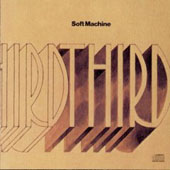
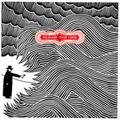
Would Sgt. Pepper's be exactly the same without Peter Blake's cover ? At a time when full-length records do not mean much any longer and album covers even less, I found interesting to make a website on sleeve design. Long before videos, record covers were the visual embodiment of music, a way to put images on sound. I remember having spent hours as a teenager detailing the cover of records while listening to them. Later on, I realised that some of them had things in common in their design, revealing either a mere sign of the times or a more deliberate connection. Some records even obviously copied famous sleeves, as a tribute or as a mockery. Here is a collection of record covers I came across, which share some common visual features.
The first never mind
 | 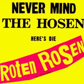 |  |
| The Sex Pistols Never Mind the Bollocks (yellow/pink) (1977) | Die Roten Rosen Never Mind the Hosen (1987) | Les Sex Bidochons On s'en Bat les Couilles (1989) |
 | 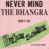 | |
| The Sex Pistols Never Mind the Bollocks (pink/green) (1977) | Opium Jukebox Never Mind the Bhangra (2002) | Pink Merkin Disregard the Genitals (2014) |
 |  |  |
| Max Pashm Never Mind the Balkans (2009) | United Nations Never Mind the Bombings, Here's Your Six Figures (2010) | The Ukrainians Never Mind the Cossacks (2014) |
Subscribe to:
Posts (Atom)
